

Logo and Packaging Design
A tea brand that bottles the sunrise
- Client
- AM'Brew
- Sector
- Tea
- What we did
- Logo Design, Packaging Design
Anytime is Teatime
AM’Brew isn’t just tea—it’s a celebration of Sri Lanka’s lush tea gardens and the art of savoring moments. As a brand offering premium Black Tea and Milk Tea Mix, AM’Brew sought a design that bridges heritage with modern simplicity. Weloveit’s challenge was to translate the warmth of a morning brew into a brand identity that resonates globally while staying rooted in its origins.
The Challenge
The heart of the challenge lay in distilling the soul of Sri Lanka’s tea culture—the crisp dawn air over terraced hills, the ritual of handpicking tender leaves at seasonal peaks, and the duality of a brand named for morning rituals (AM’ Brew) yet designed for teatime anytime. AM’Brew needed a visual identity that could simultaneously honor centuries-old traditions and appeal to modern, global consumers, all while differentiating itself in a saturated market. We had to translate intangible elements—the warmth of a sunrise, the precision of quality tea plucking, and the versatility of the product—into a cohesive design language that felt both nostalgic and fresh. Every detail needed to whisper “heritage” without sacrificing boldness, evoke serenity without fading into the background, and balance the earthy authenticity of tea gardens with the sleekness demanded by contemporary aesthetics.
The Logo
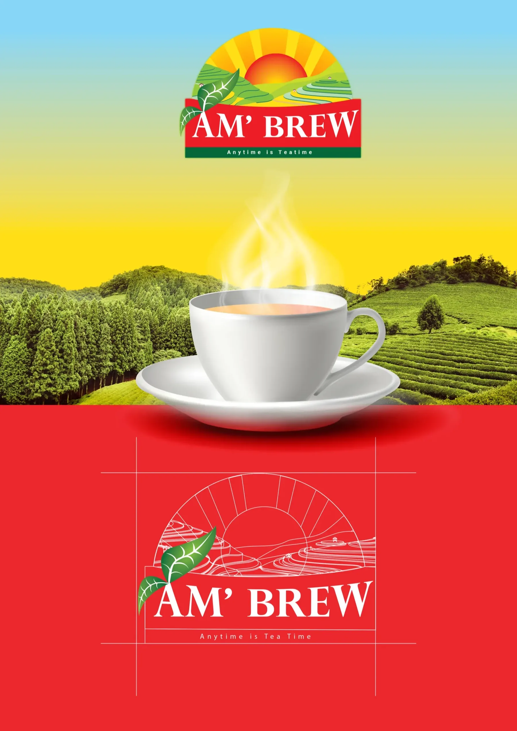
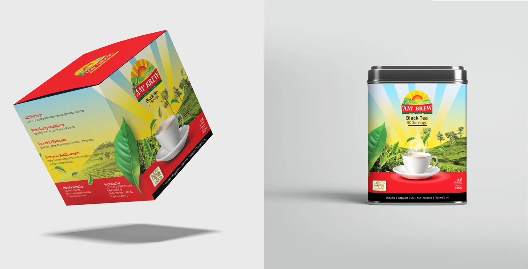
The logo is a love letter to Sri Lanka’s tea country. We drew inspiration from the sun rising over the Central Highlands, symbolizing renewal and energy. The emblem features a stylized sunburst cradling a tea leaf, marrying simplicity with depth. The leaf’s delicate veins nod to the brand’s commitment to quality—only the finest tips, plucked at peak season. Clean lines ensure versatility, from packaging to digital touchpoints.
Font
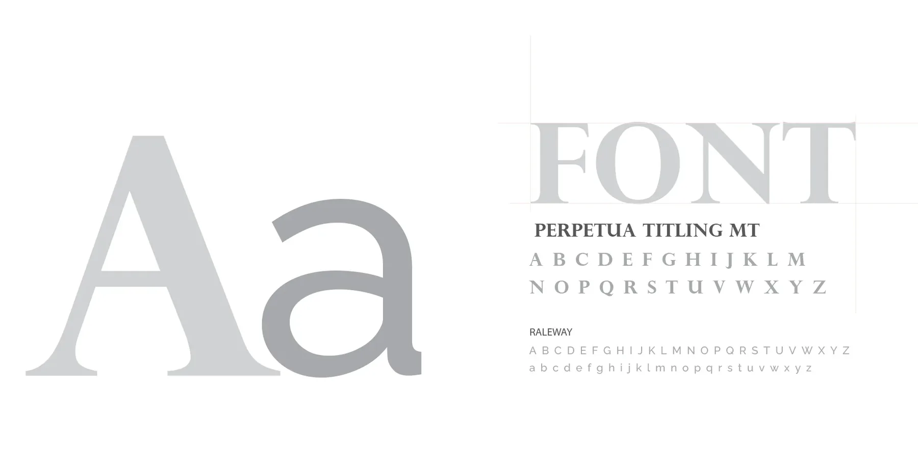
Perpetua (timeless, elegant serif) paired with Raleway (modern, airy sans-serif) reflect the brand’s harmony of tradition and innovation.
Sunrise Yellow: Energy and optimism.
Spiced Red: Warmth and richness of flavor.
Leaf Green: Connection to nature and freshness.
Black & White: Bold contrast for sophistication and clarity.
The palette mirrors the journey from dawn to daylight, inviting consumers to pause and savor.

Packaging Design
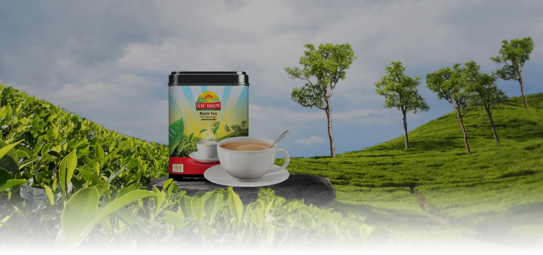
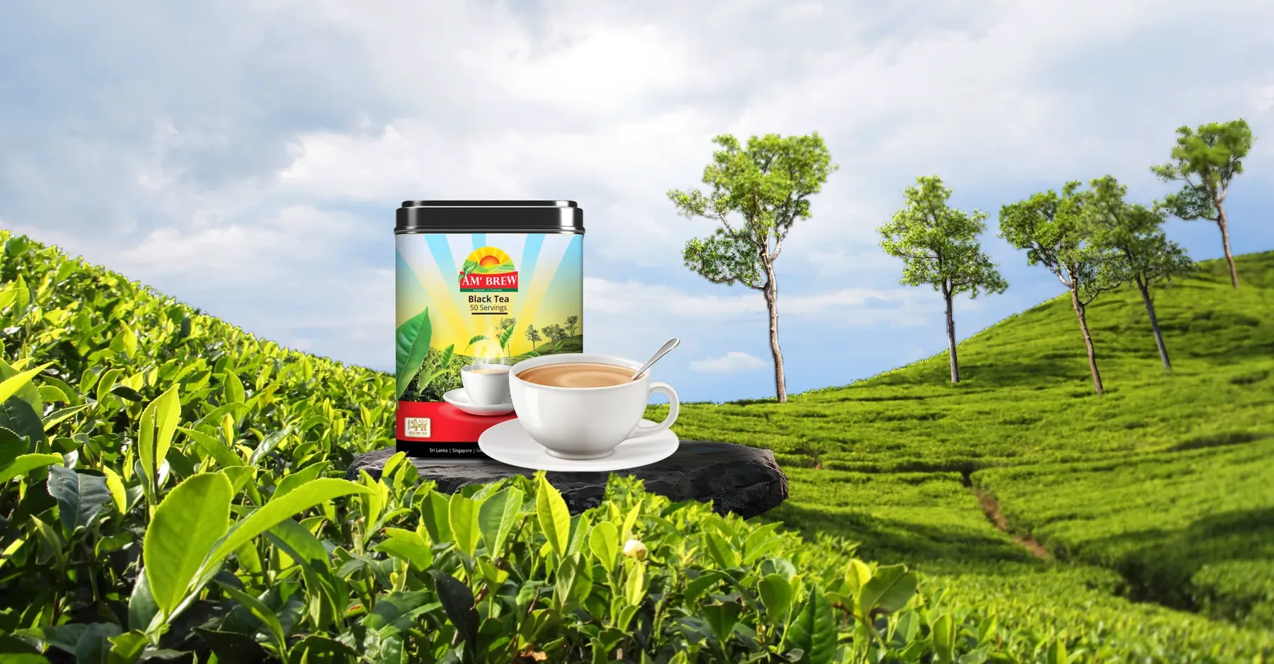
The packaging immerses customers in AM’Brew’s world. Each box features a gradient of sunrise hues, with abstract illustrations of terraced tea gardens wrapping around the sides. A matte finish evokes the morning mist, while foil accents on the logo mimic the first rays of sunlight. On the rear, a small narrative shares the brand’s story—Sri Lankan heritage, sustainable practices, and the art of brewing. The Milk Tea Mix pouch uses softer curves and cream tones, contrasting the Black Tea’s bold angular design.
What changed
- 85%increase in shelf standout during consumer tests.
AM’Brew’s rebrand brewed success:
“Feels luxurious yet authentic” echoed in 92% of customer feedback.
Launched in 5 new international markets within 6 months.
Featured in World Tea News as a “masterclass in storytelling through design.”
Weloveit didn’t just design a logo—we bottled a sunrise. Now, every AM’Brew package whispers, “This is your moment.”
